MORE WORK
MORE WORK
MORE WORK
MORE WORK
MORE WORK
MORE WORK
MORE WORK
BAM's retiring Canadians managed savings across 3+ institutions, yet no single digital platform gave them a unified view, a clear transfer process, or any guidance on whether their money would last. I conducted secondary research across Canadian demographic data, competitor analysis, and retirement psychology — then used AI design tools to move from research to clickable prototype in 5 days.
Client
Self-Initiated
Year
April 2026
Category
Fintech
AI-Accelerated Prototyping with Claude Design

·
Conducted end-to-end UX research independently, using secondary sources including Statistics Canada, FCAC reports, and CPP Investments data
·
Developed three hypothesis-based personas grounded in retirement planning psychology and Canadian financial regulation
·
Evaluated Google Stitch, UX Pilot, and Figma Make before selecting Claude Design based on their fit for senior-first financial UI
·
Documented every prompt iteration, AI output, and limitation honestly — treating the process as a design artifact, not just a shortcut
·
Applied human refinement for accessibility compliance, trust conventions, and plain-language microcopy where AI consistently fell short
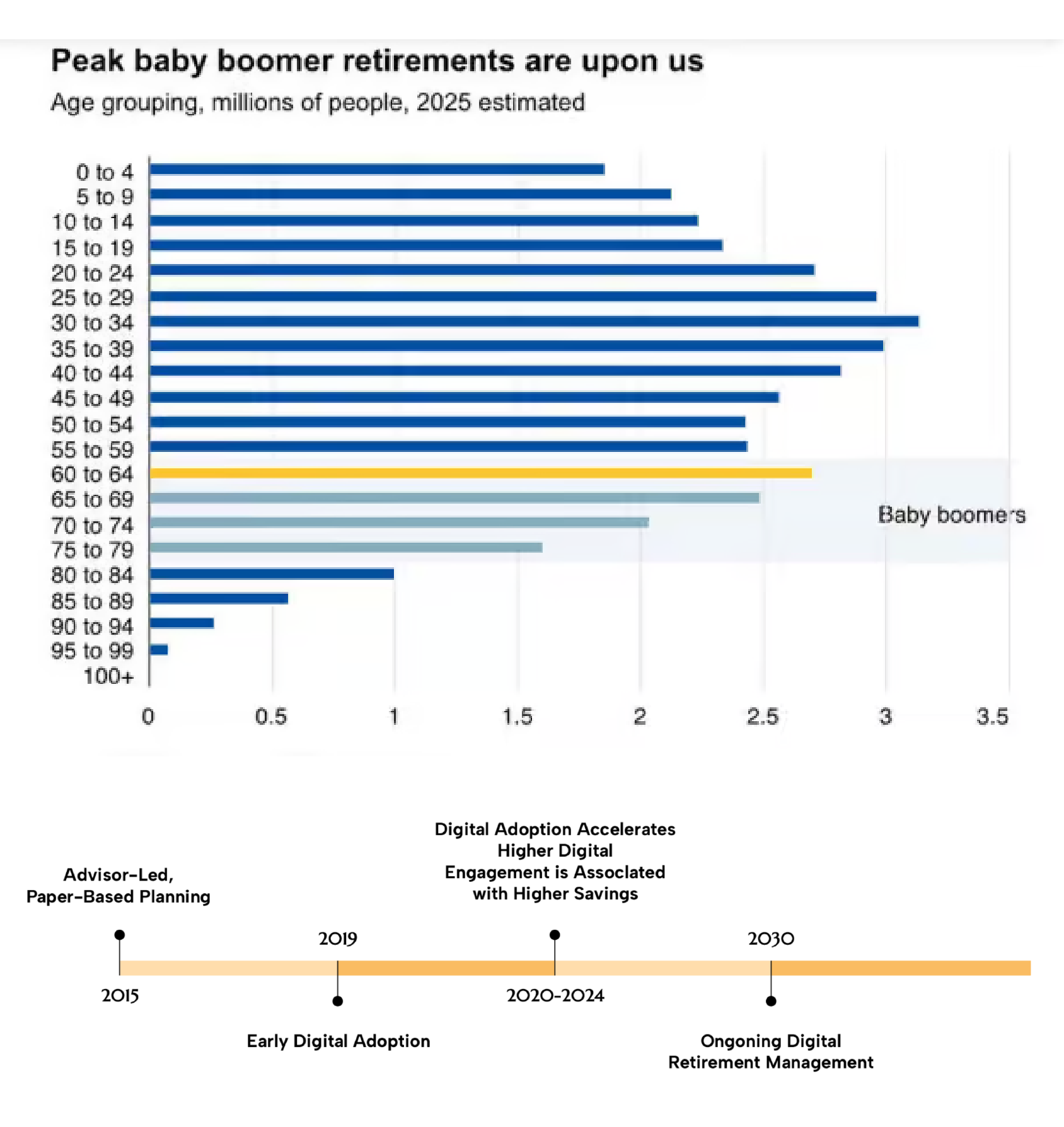
Canadians typically hold RRSPs, TFSAs, RRIFs, and pensions across multiple banks. 67% manage 3 or more accounts at different institutions — but no platform consolidated them into a single view. Users had to log into multiple systems with different passwords and piece together their own financial picture.
When retirees tried to consolidate accounts, they faced a 6–8 week process with zero status visibility — paper forms, phone calls, and no way to know if the transfer was even moving. The emotional impact was significant: "Where is my money? Is this going correctly?"
Nearly half of Canadian retirees had no formal plan for how much to safely withdraw each month — leading to either overspending that risked depleting savings, or underspending that reduced quality of life. No Canadian platform addressed this gap.

With a 5-day project timeline, I relied on structured secondary research rather than primary interviews. This included desk research across Canadian retirement statistics and government data, competitive analysis of Wealthsimple, Questrade, RBC, and TD platforms, regulatory review of RRSP/RRIF/TFSA/LIF rules, and market trend analysis of digital adoption among seniors aged 65–75.
Retired Teacher

·
Has savings scattered across RRSP, TFSA, and pension at different banks — no single place to see if her money will last
·
Doesn't know how much she can safely withdraw each month without running out before age 90
Retired IT Manager

·
No platform lets him compare withdrawal strategies side-by-side or model the tax impact of different sequences
·
Existing tools hide their logic — he can't verify recommendations or export data to validate his own assumptions
First-Time Solo Manager

·
Managing retirement finances alone for the first time after losing her husband — overwhelmed by accounts she didn't open herself
·
Can't find a platform that explains what each account type means and what action she needs to take next
Research insights from Statistics Canada, FCAC reports, CPP Investments studies, and competitive analysis that directly shaped the design decisions.
1. Fragmentation is the root of retirement anxiety
67% of Canadian retirees manage 3 or more accounts across different institutions, yet no single platform consolidates them into one view. Users log into multiple systems, receive paper statements at different times, and cannot see their total retirement picture at a glance. This directly shaped the Account Consolidation Hub as the non-negotiable first feature — without it, BAM has no unique value over existing bank websites.
2. Transfers are the most painful moment in the entire journey
Industry data shows account transfers take 6–8 weeks on average with zero status visibility. Retirees described the waiting phase as deeply stressful — calling banks repeatedly just to ask "where is my money?" No Canadian financial institution currently offers digital transfer initiation or real-time tracking. This validated building the Transfer Orchestration System as a Tier 1 MVP feature, and directly drove the design of the 6-screen status timeline.
3. 42% of retirees have no withdrawal plan — and existing tools don't help
CPP Investments research found that nearly half of Canadian retirees lack a formal withdrawal strategy, leading to either overspending that depletes savings or underspending that reduces quality of life. Competitor platforms focus on accumulation, not decumulation. This gap shaped the Retirement Income Builder — a plain-language withdrawal tool with scenario comparison and tax sequencing guidance, designed specifically for the phase competitors ignore.
4. Senior users are more digitally ready than assumed — but trust is everything
Research showed COVID-19 significantly accelerated digital adoption among retirees aged 65–75. Canadians who regularly use digital retirement tools have higher savings rates and lower anxiety. However, competitors still rely on dense interfaces full of financial jargon. This finding drove every visual decision: calm neutral palette, generous whitespace, plain-language labels, and visible security cues — because clarity builds trust, and trust drives adoption.
Build a Consolidated Account View
No existing platform shows retirement accounts across multiple institutions in one place — a clear opportunity to deliver immediate value on first use.
Digitize and Demystify Transfers
The entire transfer process relied on paper and phone calls. Digitizing it with real-time status tracking would be first-to-market in Canada and directly address the highest-anxiety user moment.
Guide Withdrawal Strategy in Plain Language
42% of retirees lack a formal withdrawal plan. A tool that answers "how much can I safely withdraw?" in plain language — without requiring a financial advisor — fills a gap every competitor has ignored.
I followed a research-first, AI-accelerated sprint — spending 3 days building a solid research foundation before using AI tools to generate and iterate screens on day 4, then applying human refinement and accessibility review on day 5.
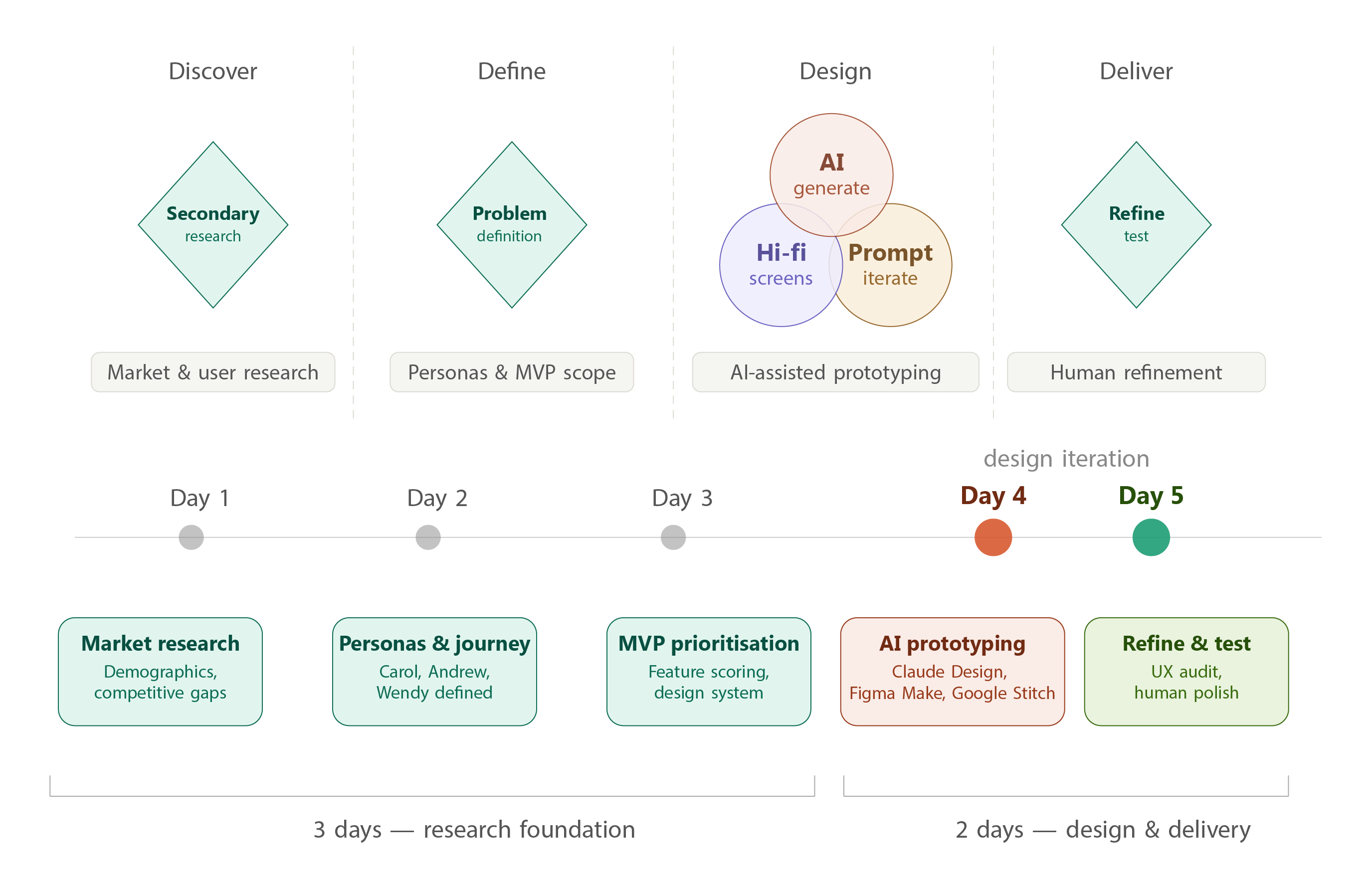
AI-generated, human-refined — April 2026
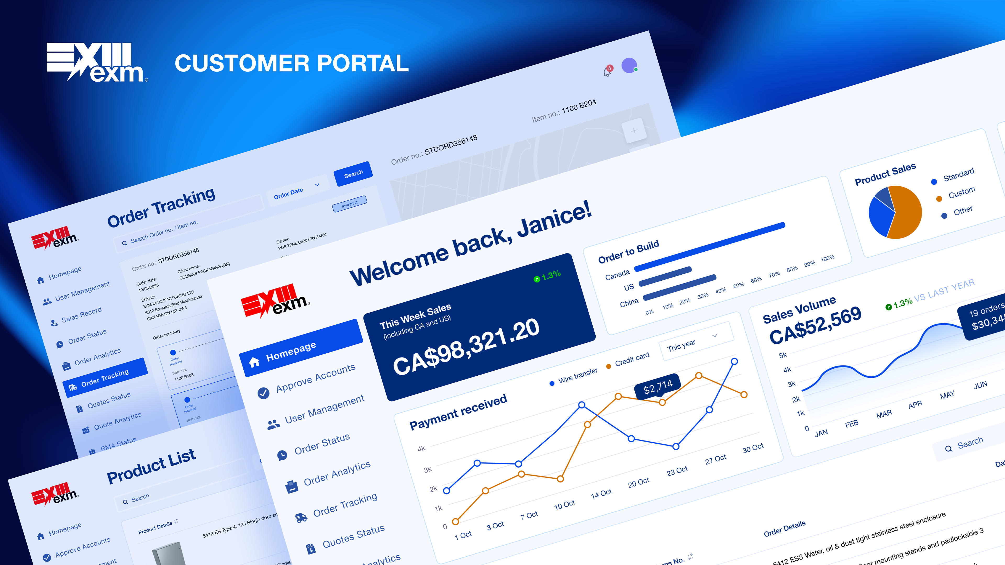
The dashboard puts the single most important answer front and centre: your total retirement wealth, how long it will last, and what to do next. Rather than showing every account in isolation, BAM consolidates all RRSPs, RRIFs, TFSAs, and non-registered accounts into one view — with live institution badges, last-updated timestamps, and a clear next action surfaced automatically.
The right panel reduces the anxiety of the transfer process by making progress visible at a glance — carrier, day count, and a direct tracking link — so users never have to call to ask where their money is.

Three key screens were designed: the Account Consolidation Hub (unified dashboard), the Transfer Orchestration System (6-screen flow from initiation to live status), and the Retirement Income Builder (withdrawal strategy tool with scenario comparison). All screens were designed desktop-first at 1440px, optimized for Conservative Carol — the senior-first persona — with 16px+ body text, 44px+ touch targets, generous whitespace, and plain-language microcopy.

1. Senior-first by default, not as an afterthought
Carol's accessibility needs — large type, calm hierarchy, reassurance cues, error-tolerant flows — became the baseline for all three personas. Designing for the lowest-confidence user made the experience better for everyone.
2. AI for layout, human judgment for trust
I tested three AI design tools across the project — Google Stitch for dense dashboard layouts, UX Pilot for multi-step workflow logic, and Figma Make for interactive states — before finalising screens in Claude Design. No single tool handled both complex financial data and senior-first accessibility well.
Human refinement was applied throughout for compliance messaging, trust indicators, and plain-language labels — the parts every AI tool consistently got wrong.
3. Calm visual direction over financial data density
Competitor analysis showed that saturated financial UIs (heavy use of red/green, dense tables) increased anxiety for senior users. BAM's palette — deep navy, soft teal, cream — was chosen to signal trust and stability without triggering alarm.
Tool Evaluation
Before settling on Claude Design, I evaluated three AI design tools against criteria specific to this audience: data-density handling, workflow completeness, and accessibility readiness for users aged 65–75.Google Stitch was strongest for generating dense dashboard layouts quickly. UX Pilot enforced workflow logic better across multi-step flows. Figma Make produced interactive states and prompt-to-code output. None of them consistently handled both complex financial data presentation and senior-first accessibility at the same time — which led me to Claude Design for the final screens, where I had more control over iterating through prompts with my full research context loaded in.
Prompt Engineering
Rather than jumping straight into screen generation, I uploaded my full 118-page research report to Claude Design and let it read the entire document first — personas, competitive analysis, MVP priorities, and design system decisions — before writing a single prompt.
What happened next was unexpected: instead of generating screens immediately, Claude Design asked me a series of clarifying questions to confirm the design direction. Which screens to build. Which persona to optimise for. What viewport, what level of interactivity, what visual tone.This forced a useful discipline — I had to make explicit decisions I might otherwise have left vague, like whether to prioritise Conservative Carol's clarity needs or Active Andrew's data density.
Answering those questions before any design was generated meant the output was grounded in real research decisions, not AI defaults.Every subsequent prompt followed the same research-first principle: user context from the report → specific screen requirements → accessibility constraints → expected output. The research document became the single source of truth that kept every iteration consistent.
Where Claude Design fell short
These gaps required deliberate human refinement — and documenting them is itself the point. Claude Design accelerated layout and structure significantly. It did not replace the judgment needed to design for high-stakes financial decisions made by anxious, older users.


1
Structured prompts produce dramatically better AI results than free-form ones. Framing every prompt with user context, required components, design constraints, and accessibility requirements reduced AI iteration cycles significantly — and made the output actually reviewable against real user needs.
2
Senior-first accessibility isn't a separate track — it's just good design. Every constraint that made Carol's experience clearer (bigger type, more whitespace, fewer choices per screen) also made Andrew's and Wendy's experience less stressful. Designing for the hardest user benefited everyone.
3
Honest documentation of AI limitations is more impressive than hiding them. The most valuable part of this case study isn't the screens — it's the prompt engineering log that shows how I iterated, what the AI missed, and why human judgment still matters in high-stakes financial UX.