MORE WORK
MORE WORK
MORE WORK
MORE WORK
MORE WORK
MORE WORK
MORE WORK
An AI-driven restaurant recommendation app, using data insights to refine personalization algorithms and craft a more intuitive discovery experience that significantly improved user engagement and conversion.
Client
BudsAlike
Year
December 2021 - December 2022
Category
Data-Driven Personalization
AI-Powered Recommendation System
·
Sole designer on the project, owning the full design process from research to final UI — including onboarding, the Foodprint feature, and the complete design system
·
Conducted user research through internal team workshops, one-on-one phone interviews with 10 users, and A/B testing to validate design decisions
·
Designed and illustrated the Budler mascot characters — a set of branded food characters that shaped the app's playful visual identity
·
Collaborated directly with developers to ship the app on iOS and Android, ensuring design accuracy and consistency throughout
Users were overwhelmed by too many options on existing platforms, with no meaningful way to narrow down choices based on their personal taste.
Generic suggestions based on ratings and distance failed to reflect individual preferences, leading to low trust and repeated trial-and-error.
Users had no easy way to track what they'd tried, what they liked, or build a taste profile over time — making every search feel like starting from scratch.
Measured over a 3–6 month live period on iOS and Android.
Users Acquired
Active users onboarded during the live period on iOS and Android
App Store Rating
Rated on both iOS and Android before sunset
A/B Testing
Active users grew to 34K within the first year, reflecting strong organic discovery and repeat visits.
Returning Users
Regular users who returned and provided positive feedback on recommendation quality
To understand how people in Hong Kong discover and choose restaurants, I ran a mixed-methods research process. I facilitated internal team workshops to align on assumptions early, then conducted one-on-one phone interviews with 10 users to uncover real pain points around dining decisions. Key themes that emerged included decision fatigue from too many options, distrust of generic rating-based recommendations, and a lack of any personal taste memory across sessions. These insights directly shaped the Foodprint concept and the AI recommendation logic.
Health-Conscious Student

·
No platform to record her food journey and share personal experiences publicly
·
Doesn't know where to find tailor-made restaurant recommendations that fit her lifestyle
The Busy Foodie

·
Too busy with work to spend time exploring new restaurants
·
Overwhelmed by too many choices with no quick way to get a matched recommendation
Food Photographer
·
No easy way to log his food journey and link it to past meals for reference
·
Too many options when choosing a restaurant that's worth photographing
I conducted phone interviews with 10 users from the 20–30 age group in Hong Kong, alongside a survey that gathered 20 responses. The goal was to understand how people currently discover restaurants, what frustrates them about the process, and what would motivate them to use a food recommendation app.
Primary objective — Uncover real pain points around restaurant discovery and decision-making, and understand how users currently track or share their dining experiences.
Secondary — Explore attitudes toward rewards and social features to inform the app's engagement and retention design.
Personalised Discovery
Users wanted recommendations that actually reflected their taste, not just popularity or distance. This created an opportunity to design an AI-driven system that learns from each user's dining history.
Tracking the Food Journey
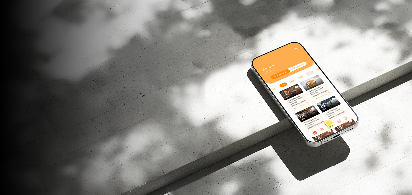
Many users had no way to remember or revisit what they'd eaten and enjoyed. This led to the Foodprint feature — a personal log that also feeds back into improving their recommendations over time.
Rewards as Motivation
Survey responses showed users were open to using an app more consistently if there were rewards involved. This shaped the Budsmark rewards system to drive retention and repeat engagement.
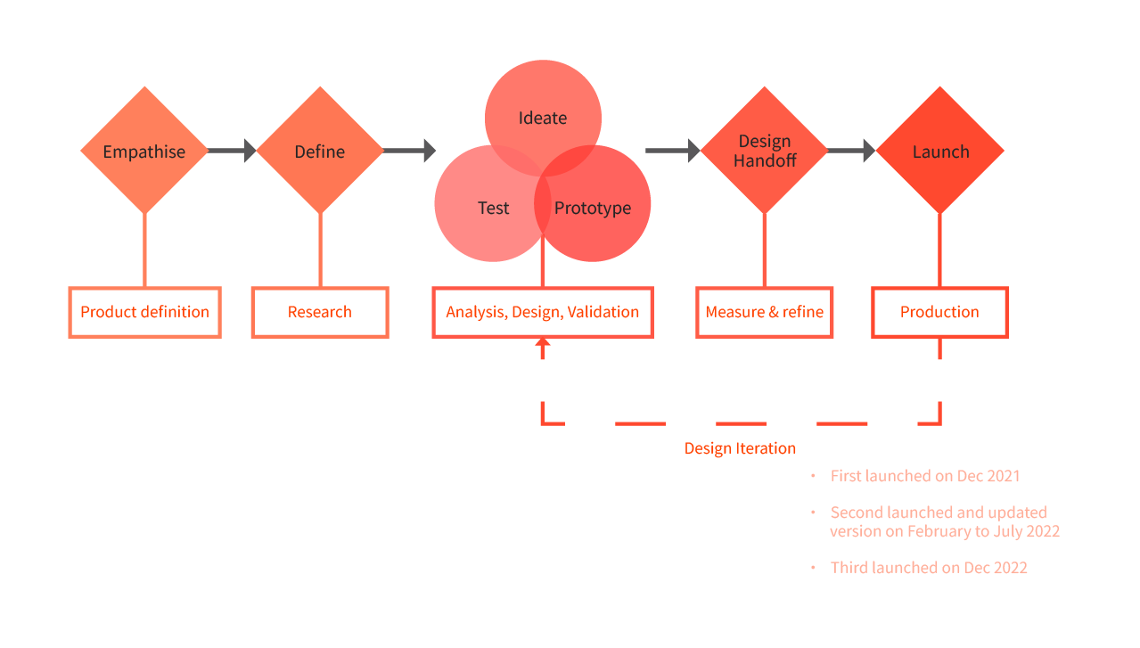
I followed a double-diamond process across three launch cycles, continuously iterating based on real user feedback from December 2021 through December 2022.
Research insights from 20 survey responses and 10 user interviews that directly shaped the product and design decisions.
1
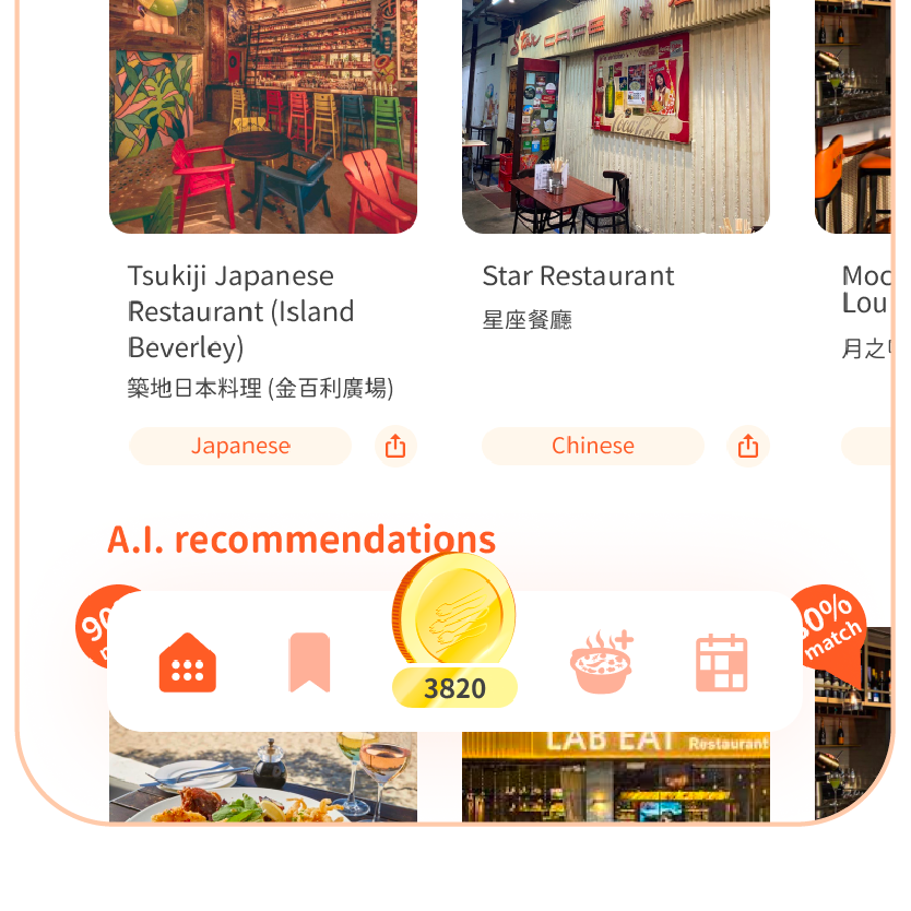
Photos ranked as the top consideration when choosing a restaurant, above food quality, location, and price. This directly shaped how we prioritised high-quality restaurant imagery throughout the app's UI.
2
55% of users struggled with too many options when choosing where to eat, and most were discovering food through Instagram with no structured way to narrow down choices. This validated the need for a personalised AI recommendation engine at the core of BudsAlike.
3
55% of users said they would use an app because of rewards, and 77.8% specifically wanted cash rewards. This directly informed the design of the Budsmarks rewards system to incentivise repeat usage and community contributions.
TO INFORM
Help users discover restaurants that genuinely match their personal taste, cutting through the noise of overloaded choices on existing platforms.
TO ENGAGE
Build a dining experience that gets smarter over time — the more users log their Foodprints, the more accurate and personalised their recommendations become.
TO GUIDE
Give users a clear, intuitive path from discovery to decision, with rewards along the way to encourage exploration and community contribution.
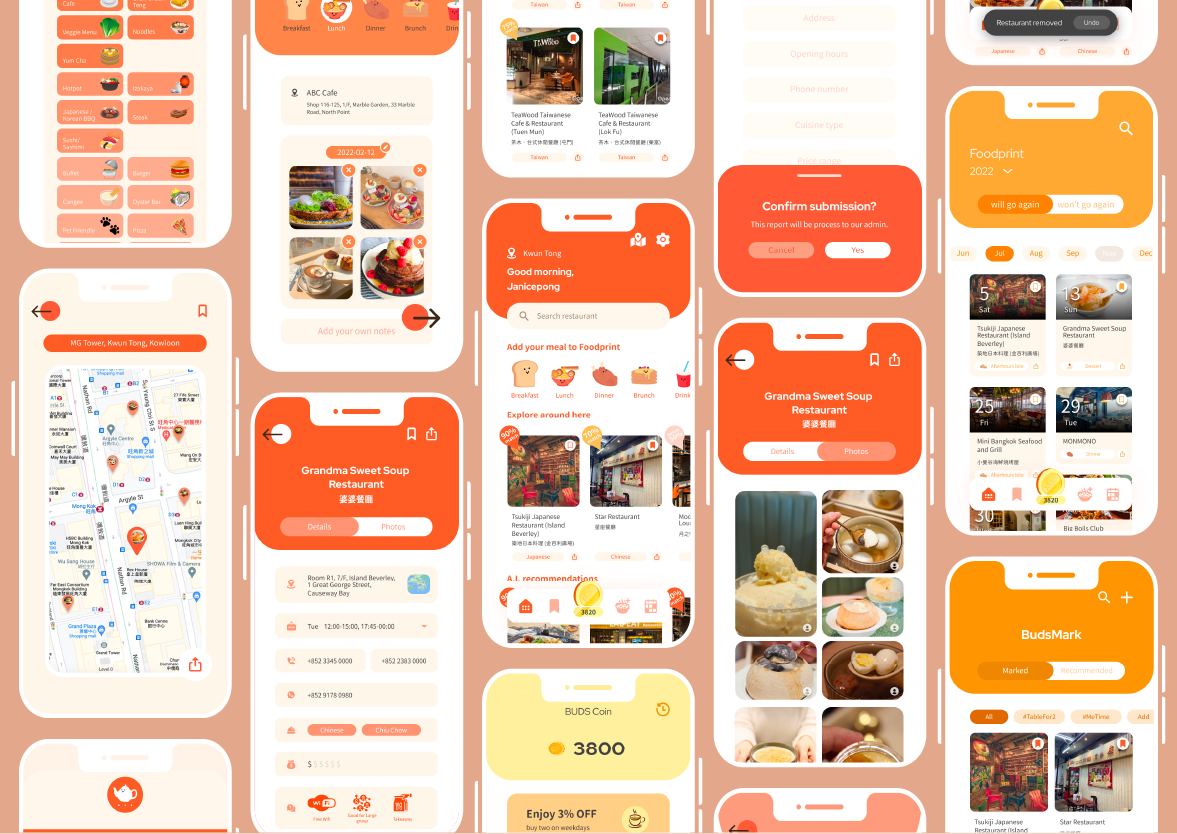
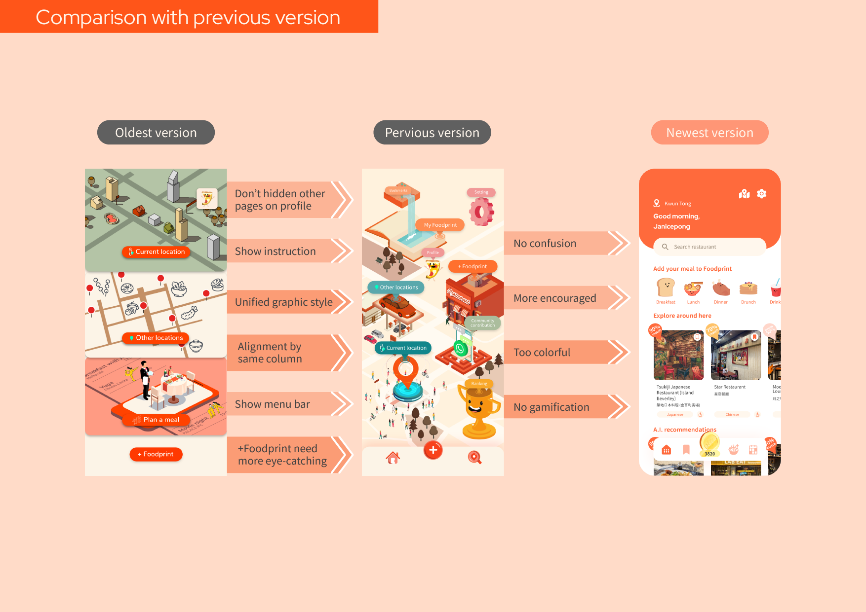
Version 3 — December 2022
After two rounds of iteration, the final version brought everything together into a clean, intuitive experience. The home screen surfaces AI recommendations and Foodprint logging front and centre, making the app's core value immediately clear from the moment users open it.
Navigation was simplified, visual consistency was unified across all screens, and the colour palette was refined to reduce visual noise from earlier versions — resulting in a more focused and confident product.
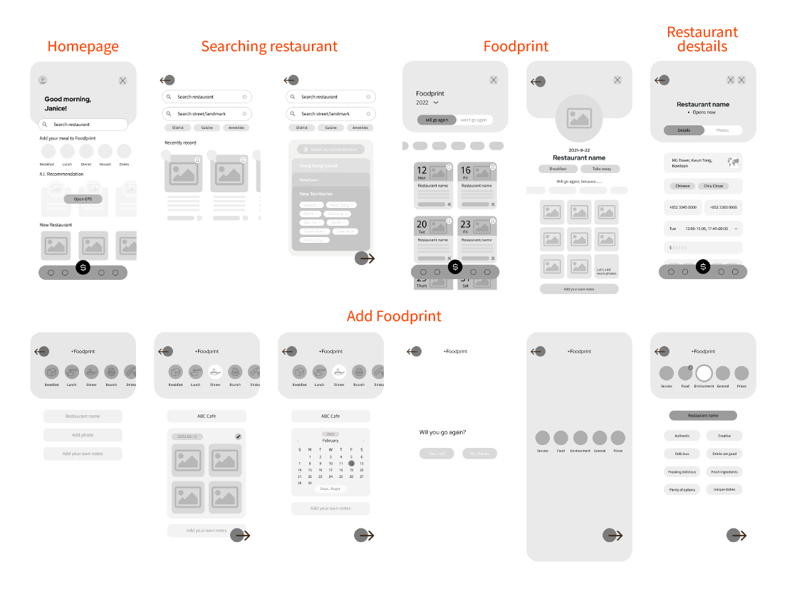
Low Fidelity
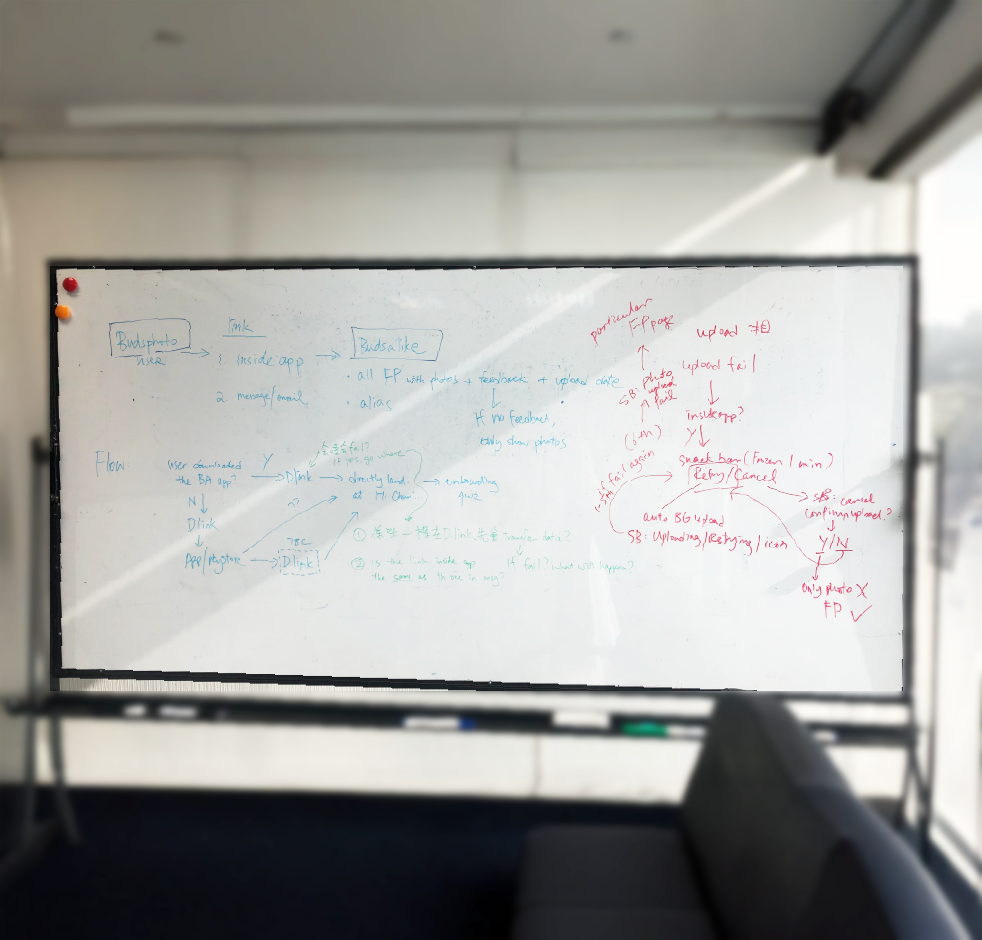
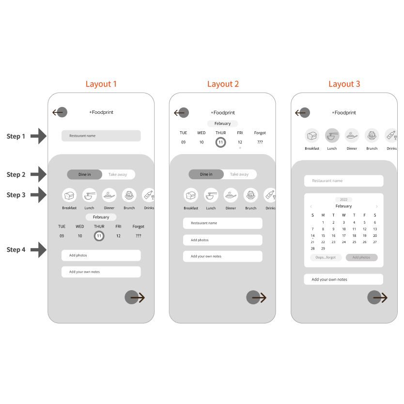
The core challenge was getting users to consistently log their dining experiences without friction. After three layout iterations and in-person A/B testing, we landed on a step-by-step flow that starts with the most memorable information first — meal type and restaurant name — and only asks for details like date and photos afterwards.
Users completed the logging flow more consistently after removing unnecessary steps
Dine-in vs. take-away option removed based on direct user feedback
Photo upload integrated inline, increasing the richness of logged entries
Calendar view reduced date confusion and improved accuracy of past meal records
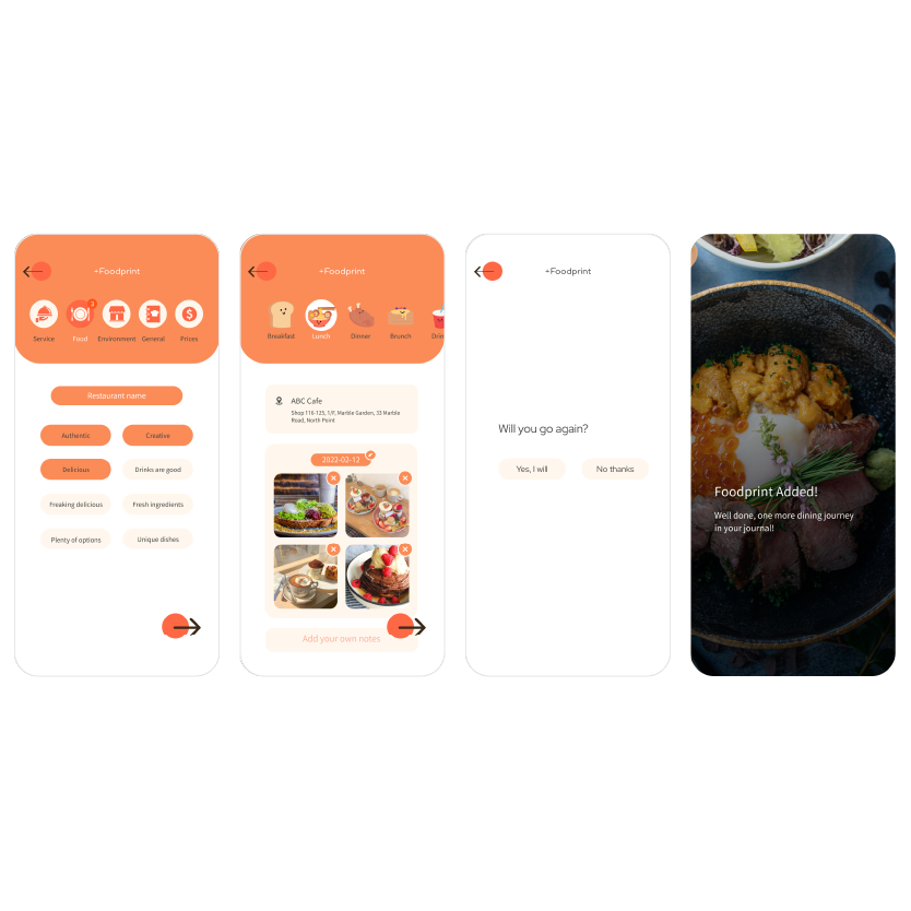
1. Meal type first, not restaurant name
Starting with meal type before restaurant name matched how users naturally think about eating — what they feel like eating before where they want to go.
2. Removed dine-in vs. take-away step
Three users flagged this as unnecessary when reviewing their food journey. Removing it simplified the flow without losing any meaningful information.
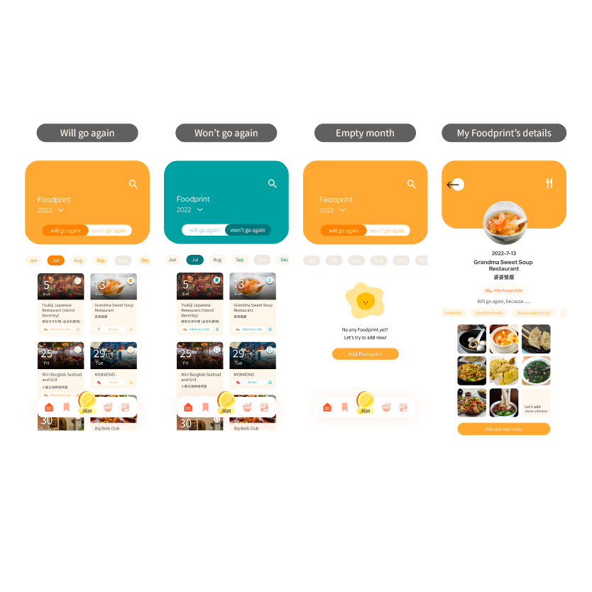
3. Full calendar over scrolling date strip
Users struggled to recall exact dates using a horizontal scroll. Switching to a full calendar view made it easier to locate past meals at a glance.
4. Photos integrated into the Foodprint flow
Adding photo upload directly within the logging flow — rather than as a separate action — encouraged users to document their meals more consistently.
The BudsAlike design system was built from scratch to ensure visual consistency across every screen — covering typography, colour tokens, UI components, and the Budler mascot characters, all illustrated and defined by me as the sole designer.
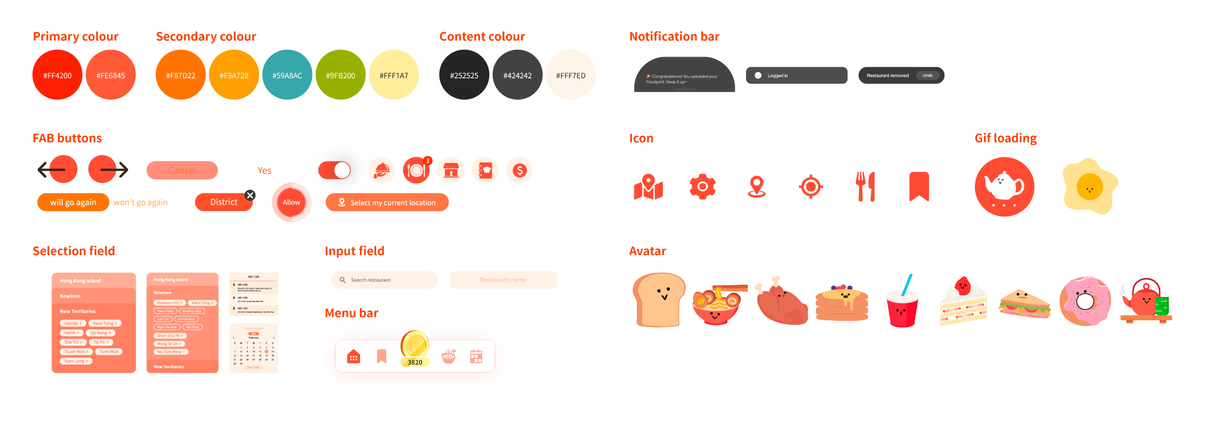
The navigation needed to surface BudsAlike's core features immediately — without burying Foodprint or AI recommendations behind extra taps. The final menu bar was designed around what users actually do most, not just standard app conventions.
The BudsCoin icon sits at the centre of the menu bar, making the rewards system the most prominent and accessible feature to encourage daily engagement.
The Foodprint tab is permanently accessible from the menu bar, reducing the steps needed to log a meal and making habit-building feel effortless.
The menu bar covers the five key user actions — calendar, Foodprint, BudsCoin, search, and settings — keeping the experience focused and free of unnecessary complexity.
The menu bar stays fixed across every screen, giving users a reliable anchor point regardless of where they are in the app.
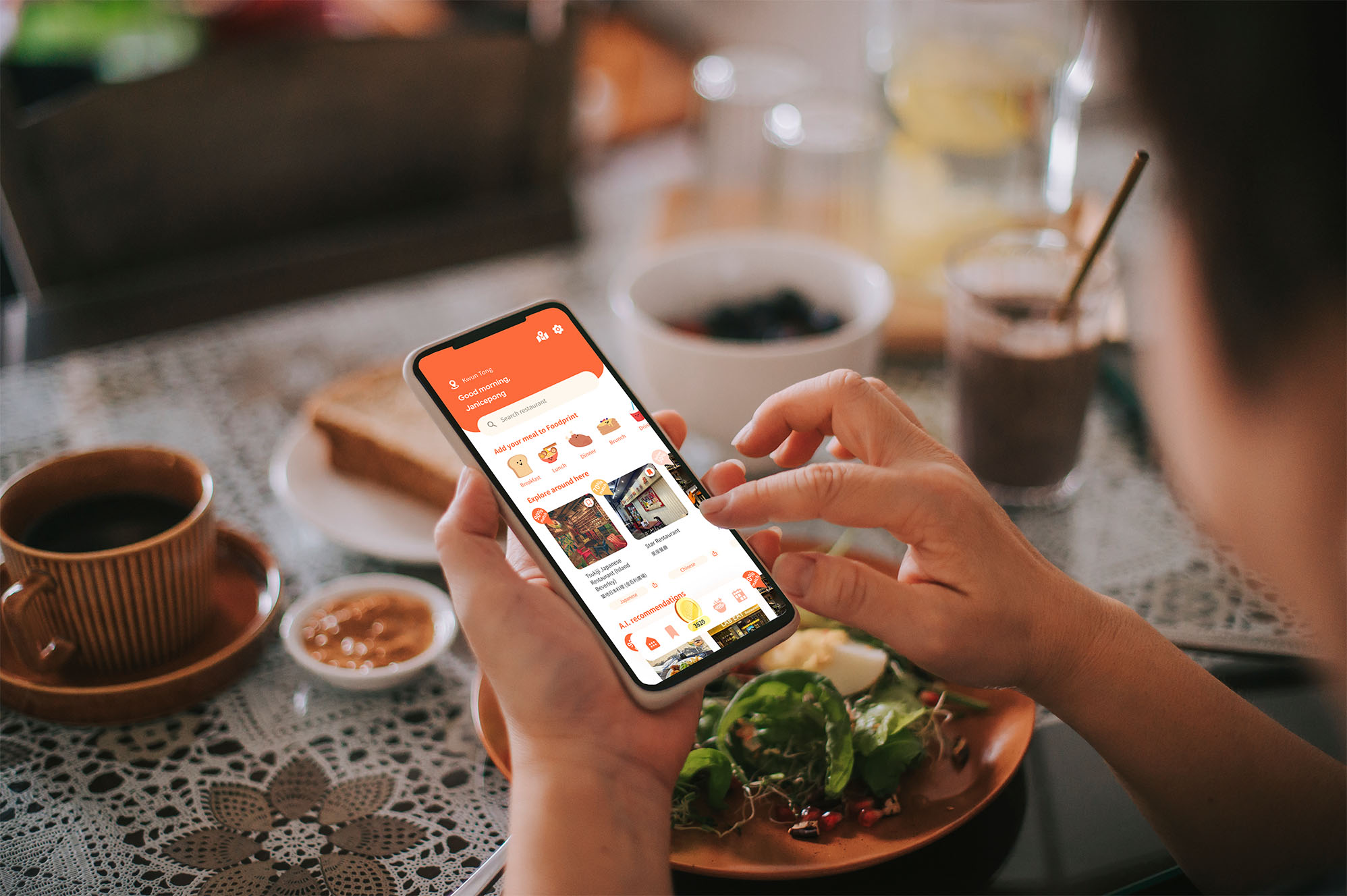
Foodprint
Log your dining experiences with meal type, restaurant, photos, and notes to build a personal food journey over time.
AI Recommendations
Get restaurant suggestions matched to your taste profile, based on similarity with other users' Foodprints.
BudsMark
Bookmark restaurants you want to visit or have enjoyed, organised by your own custom categories.
GPS Search
Discover restaurants near your current location or explore by district across Hong Kong.
BudsCoin Rewards
Earn coins by adding Foodprints and contributing to the community, redeemable for rewards.
PROBLEM
Users struggled to log their dining experiences consistently. Early layouts front-loaded too many inputs at once — meal type, dine-in vs. take-away, and date selection — causing drop-off before they could complete an entry.
DESIGN DECISION
After A/B testing three layout variations with real users, I restructured the flow to lead with the most memorable information first: meal type and restaurant name. Date and photo inputs were moved to later steps to reduce upfront cognitive load. I also removed the dine-in vs. take-away field entirely after three users flagged it as unnecessary.
OUTCOME
The simplified flow reduced friction significantly, leading to more consistent Foodprint logging. With more entries per user, the AI recommendation engine had richer data to work with — directly improving the quality of personalised suggestions over time.
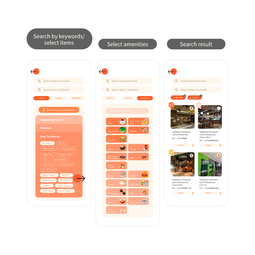
PROBLEM
Users needed a way to discover restaurants that matched both their food preferences and practical needs — like cuisine type, location area, and amenities. A keyword-only search wasn't enough to surface relevant results for a city as dense and varied as Hong Kong.
DESIGN DECISION
I designed a three-step search flow: users start by searching keywords or selecting food items, then filter by amenities, and finally browse visual search results. Location areas — such as Hong Kong Island and New Territories — were surfaced as selectable tags to help users narrow results geographically without needing to type an exact address.
OUTCOME
The layered search experience gave users more control over discovery while keeping the flow lightweight. More relevant search results meant users were more likely to find and log restaurants they actually visited, feeding better data back into the recommendation engine.
1
Real user testing reveals what assumptions miss. A/B testing the Foodprint flow with just 3 users uncovered friction points I wouldn't have caught on my own — it taught me to validate early and often, even with a small sample size.
2
Owning the full design process as a sole designer means every decision is yours to make and defend. This project pushed me to think beyond visual design — considering technical constraints, AI logic, and business goals all at once.
3
A product can do everything right and still be sunset for business reasons. BudsAlike reached real users and delivered genuine value, and losing it to a pivot taught me to document and celebrate what was built, not just what survived.