MORE WORK
MORE WORK
MORE WORK
MORE WORK
MORE WORK
MORE WORK
MORE WORK
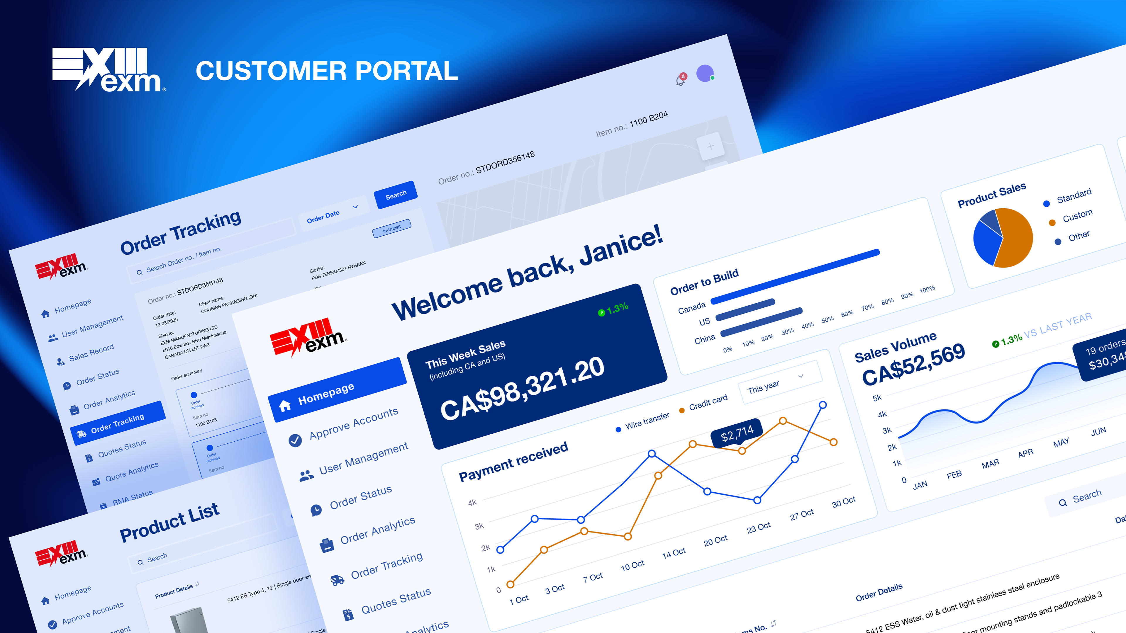
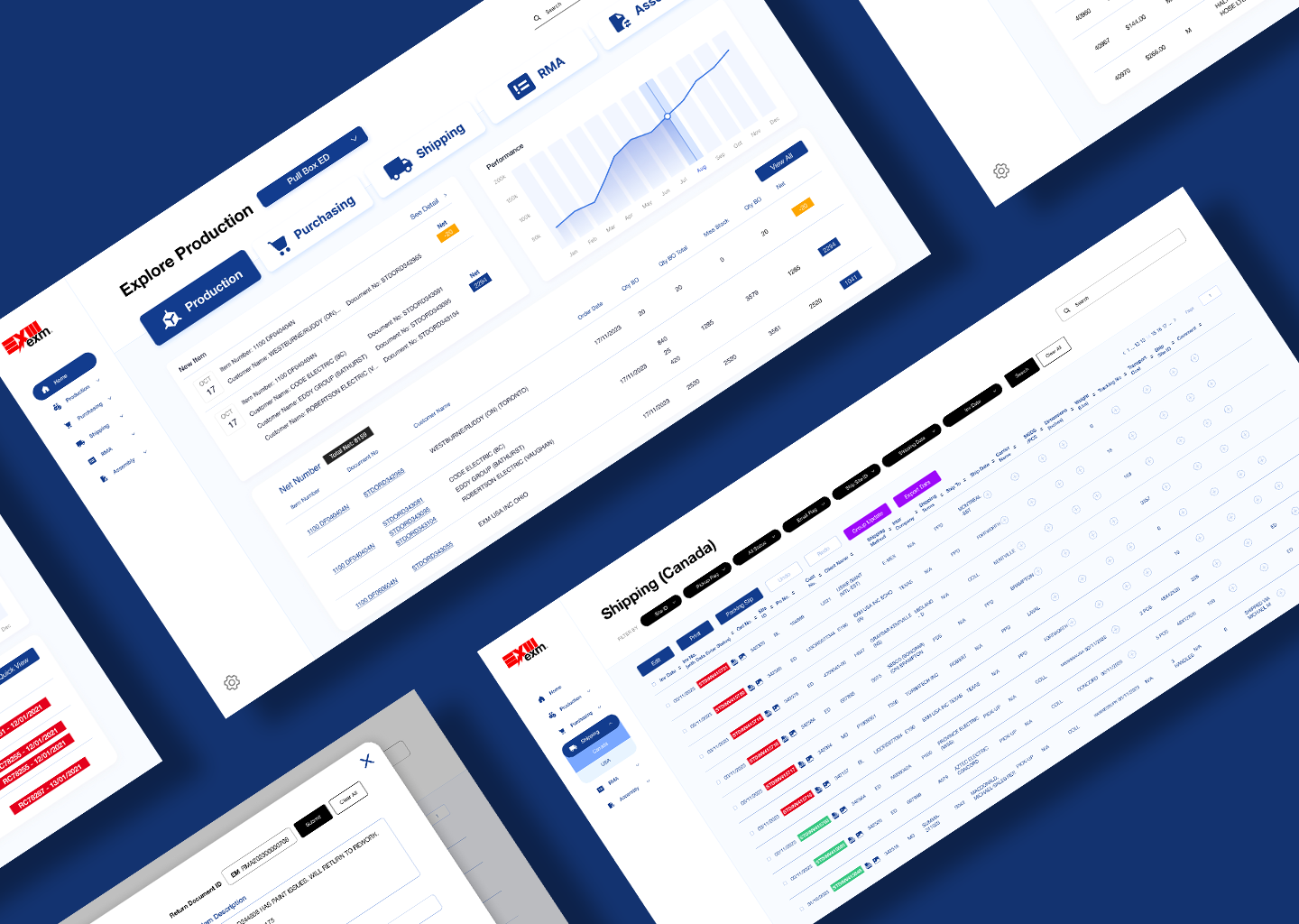
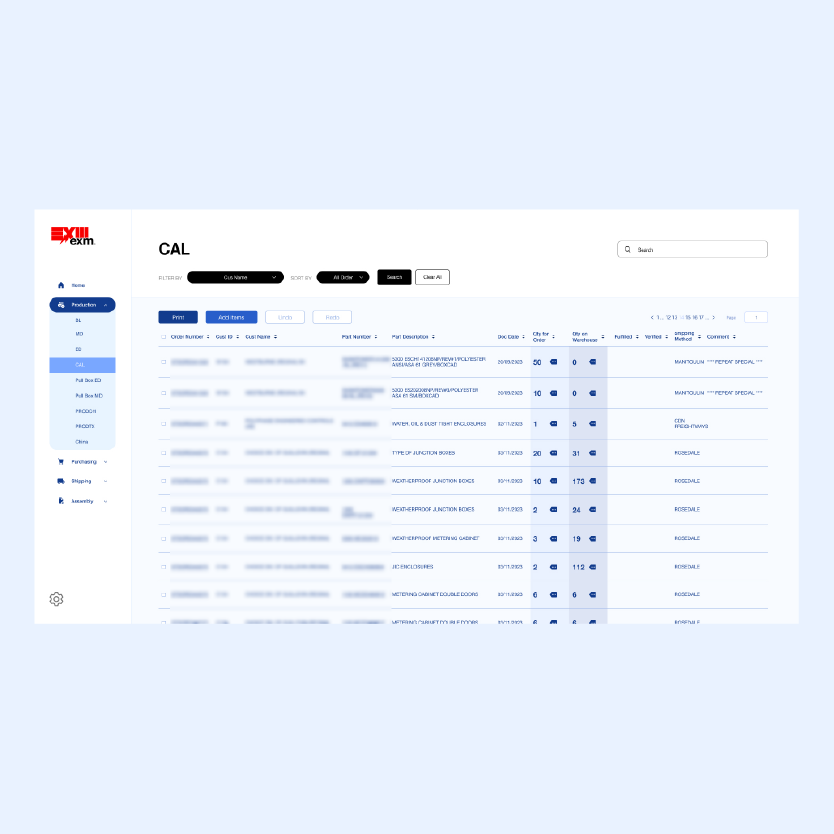
EXM Manufacturing operates across multiple locations in Canada and the United States, with five departments — Production, Purchasing, Shipping, RMA, and Assembly — running daily operations from a single internal platform. The legacy system was difficult to use: dense data tables with no visual hierarchy, a shared view with no role-based access, and a search that only worked if you already knew the order number.
Client
EXM Manufacturing Ltd.
Year
November 2023 - March 2024
Category
Product Designer & Front-End Developer
ERP System
·
Led end-to-end UX design as the sole designer, from discovery through final UI
·
Conducted workflow interviews with eight teams across Canada and the US to identify role-specific needs
·
Designed role-based dashboards, data tables, and modal flows in Figma
·
Developed the front-end in collaboration with the back-end developer, implementing the final interface in HTML, CSS, and JavaScript
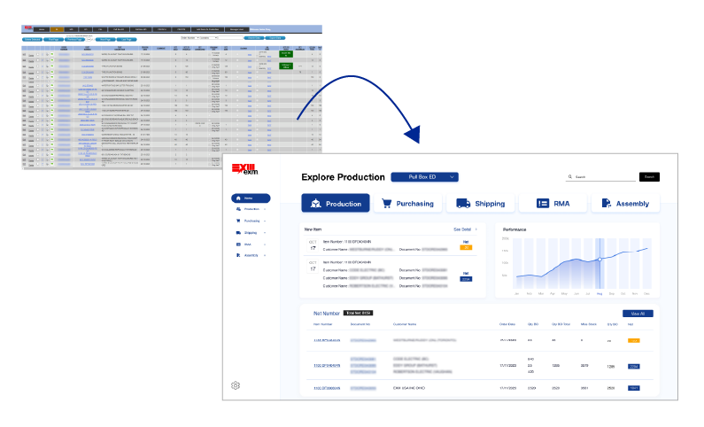
Dense data tables with no visual hierarchy made it hard for staff to scan and find what they needed at a glance.
The search function only worked with an exact order number — staff who only knew the customer name had no reliable way to locate an order.
All teams could access every department's dashboard, creating unnecessary noise and increasing the risk of accidental edits.

Talking to each team before touching the design.
Without a formal research budget or timeline, I took a pragmatic approach — meeting directly with each of the eight teams to understand how they used the system day-to-day. I focused on three questions: what data do you check every day, what slows you down, and what do you never need to see? Combined with a review of the ERP data structure alongside the back-end developer, these conversations shaped every design decision that followed.
Before finalising the design, I walked key team members through an interactive Figma prototype to validate the role-based structure and gather final feedback before development.
Insights from team workflow interviews and ERP system review that directly shaped the redesign decisions.
1
Conversations with all eight teams revealed that most columns in the existing tables were irrelevant to their daily tasks. This led to role-based dashboards that surface only the data each team actually works with, reducing cognitive load across the board.
2
Staff frequently needed to find orders but only had the customer name — not the order number the search required. This directly drove the decision to add flexible filtering by customer name, site ID, date, and status across all dashboards.
3
Because all teams shared the same view, accidental edits and confusion over ownership were common. Introducing role-based access ensured each team worked within their own space, reducing errors and improving accountability.
TO SIMPLIFY
daily workflows for staff across multiple locations by replacing a dense, hard-to-navigate interface with a clean, role-based system.
TO REDUCE FRICTION
by giving each team access only to the dashboards and data relevant to their role, eliminating unnecessary noise across departments.
TO IMPROVE FINDABILITY
so staff could locate orders quickly by customer name, site, or status — not just by knowing an exact order number.

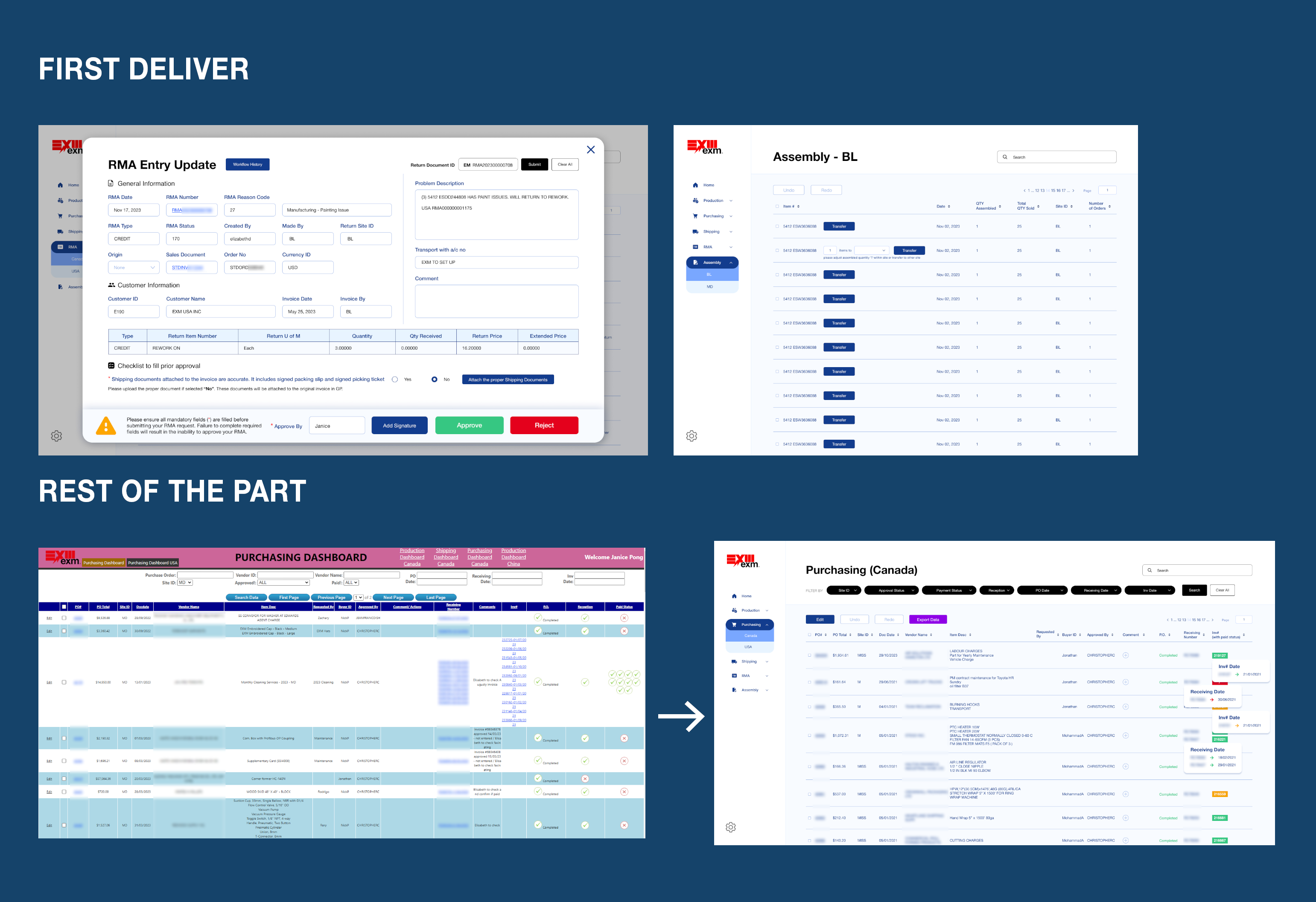
From a developer-built data dump to a role-aware operational platform.
The original system was built purely for function — every team shared the same dense tables with no clear ownership or structure. The redesign introduced a consistent sidebar navigation, role-based dashboard home pages, structured filtering, and colour-coded status indicators, giving each team a focused workspace that matched how they actually operated day-to-day.

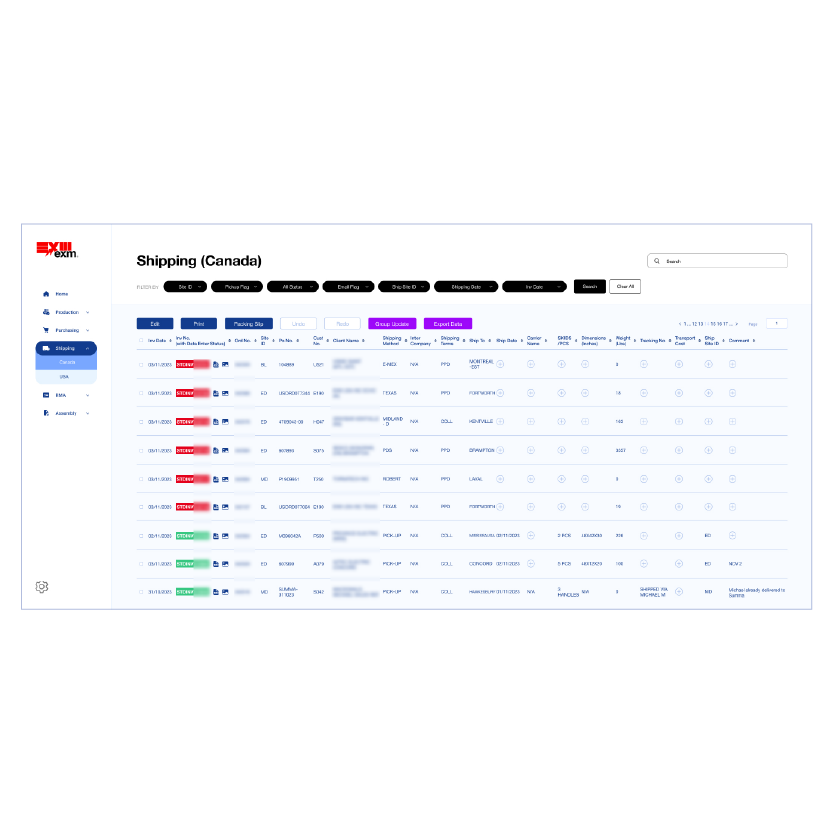
The original dashboard contained dense tables, no role separation, and a search that required exact order numbers — making daily operational tasks slower and more error-prone than they needed to be. The redesign introduced role-based homepages, structured filtering, and consistent visual patterns to help each team work faster and with more confidence.
Replaced the flat horizontal tab navigation with a persistent sidebar, giving users a clear sense of where they are across all five departments.
Introduced role-based dashboard homepages so each team lands on the data most relevant to their daily workflow.
Added flexible filtering by customer name, site ID, date, and status — so staff could find orders even without an exact order number.
Applied consistent colour-coded status indicators across all dashboards to help users spot issues and track progress at a glance.

Each department got its own full page and sidebar navigation. Modals were reserved only for specific actions, keeping the structure clean and predictable for every team.
1. Five departments, each with its own sidebar navigation and dedicated dashboard — no shared view
2. Sidebar = persistent navigation across all departments
3. No modals for navigation — each section is its own full page, modals only for specific actions
4. Structural decision: separating departments by page rather than tabs or popups gave each team a clear sense of ownership

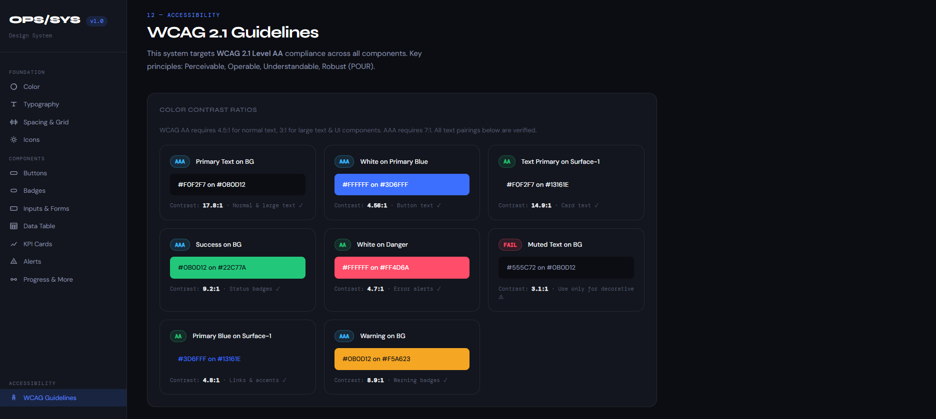
Accessibility was treated as a foundation, not an afterthought — every component in OPS/SYS was designed and documented with WCAG 2.1 AA compliance from the very start, covering 30+ components and 12 colour tokens.
1. WCAG AA was built in from the start — not retrofitted
2. OPS/SYS design system has a dedicated WCAG page with verified contrast ratios
3. Colour never used alone — badges use colour + text, alerts use colour + icon + message
4. Forms meet WCAG AA: visible focus rings, clear labels, error states with icons
5. Data tables use semantic HTML table for screen reader compatibility
RMA and Assembly launched first because Shipping and Purchasing required more complex backend integration. Shipping simpler departments early meant staff could start using the system while the harder parts were still being built.
Timeline: five months only — tight
MVP decision: launched RMA and Assembly departments first because Shipping and Purchasing required more complex backend work
Trade-off: speed of delivery vs completeness — shipping the simpler departments first, let staff start using the system while the more complex parts are being built
PROBLEM
The existing tables displayed every data point for every team in a single view — often 15 or more columns across — making it nearly impossible to scan for the information that actually mattered. Staff had to read across entire rows just to find one relevant figure.
Design Decision
Rather than simply hiding columns, I met with each team to identify which data points were essential to their daily workflow. This informed a role-based table structure where each dashboard surfaces only the columns relevant to that team, combined with sortable headers, flexible filters, and inline tooltips for additional detail on demand — so no information was truly lost, just better organized.
Outcome
Each team now lands on a focused table view tailored to their role, with quick access to deeper details when needed. Staff reported the new interface was significantly easier to navigate, reducing the time spent scanning for information during busy operational hours.
1
Talking to each team before designing anything was the most valuable step — without those conversations, I would have made assumptions about what data mattered and gotten it wrong.
2
Wearing both the designer and front-end developer hat on the same project taught me to design with implementation in mind from the start, which made the handoff to the back-end developer much smoother.
3
Role-based design isn't just about access control — it's about respect for each person's time. Showing people only what they need is itself a design decision that builds trust with users.